ccs faculty part deux
I asked "Blank Canvas" to review part one of the ccs faculty show so I see it fitting to let them finish off the review. I believe that part two is a better show than part one. There are some great pieces like robert schefman, nancy mitter, clint snider, kate silvio, nancy thayer, and joe nova - I hope you didn't miss his piece with the hole in the wall and eye looking back! Yes, there aresome bad apples of the bunch but overall a good show. Here is "Blank Canvas" to give a review...and I am sure some jokes!
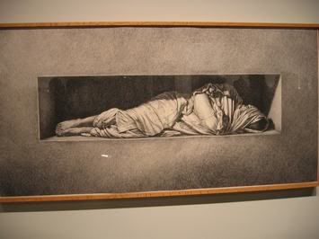
Blank Canvas: good old robbie s. this is a nice piece. it definitely was interesting to see this drawing in comparison to the painted version of the same image currently hanging at Kidd.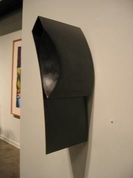
kate silvio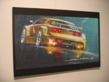
bc: money, money, money - ccs' automotive side showing once again. why does every concept car poster look the same? hasn't this discipline progressed since the early-'90s?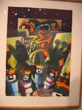
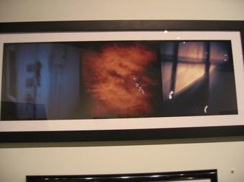
bc: some of the pieces found their way over from the scholastic show. 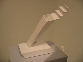
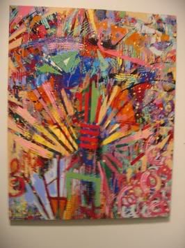
bc: the always vibrant gilda snowden.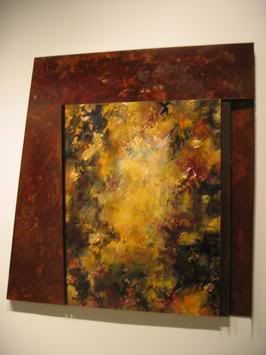
bc: materials and concept seemed to work, but the colors? totally corporate.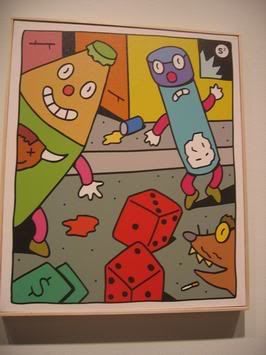
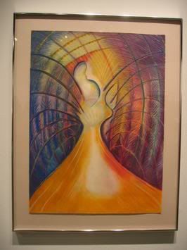
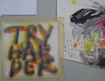
bc: this piece was called "mystic." for real.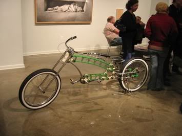
bc: someone must have ridden this over from a DAM opening.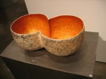
bc: part two of the faculty show had better ceramics - to the extent ceramics can be "better." everything is art, sure, but I find it hard to engage with ceramics. 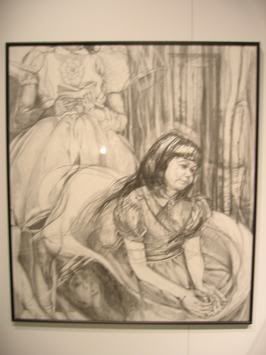
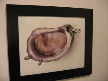
bc: I expect more from the ad department. yes, oysters look like ears. but a good oyster bar ad? hmm.
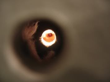
bc: joe nova's creepy squirrel eye peep hole was ... creepy. and fun.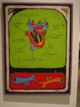
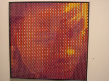
bc: composite-y looking portraits are over.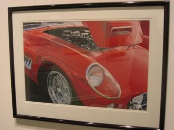
bc: somebody needs a booth at the dream cruise.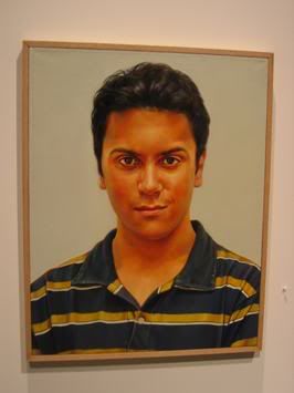
bc: nancy mitter. an excellent capturing of a quintessentially teenage facial expression. in person, this painting is quite captivating.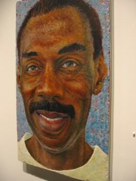
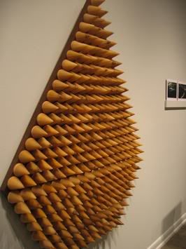
bc: cool wax/wood cone thing. nice size.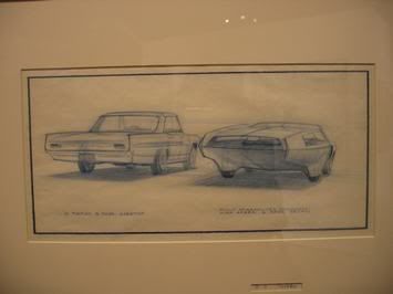
bc: old skool ccs prototype car drawings.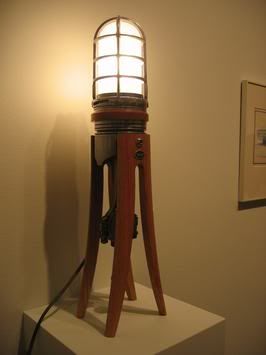
bc: one of the best in show. stephen schock's "piston lamp" was well-executed and professional looking. I could see these all over a nice restaurant or bar - a cool office even.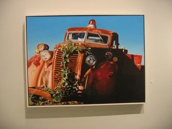
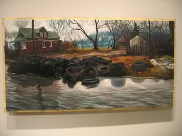
bc: uh oh, more and more people are discovering the idea of taking scenes of "detroit decay" and marrying them to high art. I think that field may be at its saturation point. 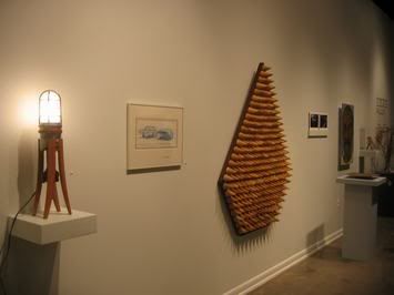
bc: I'm ready to see new work from clint. this older style stuff is cool, but I bet he has even better work to come.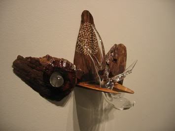
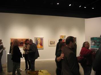
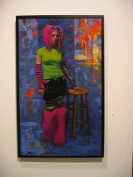
bc: painting a non-traditional subject in a standard way doesn't make for an edgy painting.
bc: part two of the faculty show was definitely stronger than part one.

11 Comments:
As a graduate of ccs 98' it is good to see that the school is still thriving even with all of the changes that have occured.
From my perspective I see the school the same way I see our gov.
Under siege. Starting in late '97
a classic ku which sent the greats
like Aris, Dennis, Tony.. off or contributed too their early graves.
94 - 97 was my favorite most positive experience. Amazingly charged with everything happening in the atmosphere and hopes for a better world in the next millineum.
You can get a glimpse of my work at:
http://www.thecaid.org/artists/artists-visual-profile.asp?aid=f_english
My work has generally been pigeon-holed by choice few whom have been
adament that I have just followed in the foot prints of Clint Snider.. I cannot tell you how frustrating and ironic this has been. Instead of artificially changing my work and core interests I have kept on my path and continued to develop. Understanding that the turtle gets there has been important. Hopefully it won't take 60 years for someone to be interested in the story and truth. I think it is an example of yin and yang. Of reactions and innovations and reactions and inno.....
ku is spelled coup
that tire painting by clint snider is like a rerun of threes company or mash. everytime i catch it on cable it always seems to be the same damn episode.
what is the un-written rule about showing works over again in such a short span of time?
to tell you the truth, i think his paintings of urban decay are not very great. The forms don't look believable.
I wasn't too impressed with Chris Mccauley's "rodney" piece. It looks really cheesy. I don't like the way it looks in encaustic. I too would like to see some different stuff of Clint's. I feel like I've seen that tire painting before. It was nice to see a portrait of his at the CAID biennial show. His "30% more" piece was hilarious! I would have to disagree with Blank Canvas on the scholastics comment because I'm pretty sure that nobody in the scholastics show could pull off Zdzislaw's technical skill, though the imagery isn't all that great. The other thing doesn't look high schoolish either. Gilda's piece was rad as was expected. Nancy Mitter's piece was alright. Technicaly really good but I guess I'm just not a fan of photo-realism. Overall, much better than the first half of the faculty show.
I like painting too! thats so great that in 97 CCS was an urban painting school. I think that decay is great looking in painting when it is actually like new painting so the decay is fakeish. When will we all be open to the closeminded art opinions of that damn NY. I hate how theu think that there big artists can come and mess around with our opinions of art. We know what art is, it is safe and risky, on the light side of conservative with touch of fatty acids and a hint of chicken liver on geese feet, but figurative. realistic man, that is where it is at.
talk to me brothers, sisters, and wise wise. We know, we will stay and look and see and make. but we will not stop to eat, but we will stop to drink. drink out of the camera of realism, in the realism. do you follow?
CCS used to have regular faculty shows, by department. It would be great if this tradition would start up again.
you mention kyle's bike in reference to the DAM as if there is something wrong with his bike, or the design show, or both (or maybe I'm taking it the wrong way).....yet you praise steve's lamp?
I don't get it. That lamp, as well as the bike, would've been right at home at the design show...though personally the lamp seems too "easy"
Joe Nova was the best teacher I ever had. I learned more watching him cook up some perch than I ever did listening to other teachers blab on and on about the avant garde. Keep up the good work Mr. Nova.
Joe Nova's piece is the ONLY true conceptual work in this show......he is Detroit's answer to John Baldessari!
Pacopez---I love your work! Sure, I'll bet people pick up on a relationship to Clint Snider's work, but the truly astute viewer would take this opportunity to see all of the DIFFERENCES as opposed to merely stopping at the similarities.
I would choose to look at this phenomenon as being similar to that created early last century by Braque and Picasso.....
Would you please contact me by email? I have a favor to ask of you.It concerns an exhibition possibility in the future. My email is Leoqueen at aol dot com.
Don't worry, you know me. I was at CCS when you were there.
Post a Comment
<< Home