whitney biennial preview
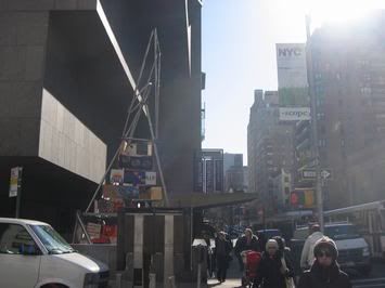
new york! (outside the biennial)
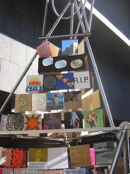
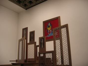
Now there was no photography allowed in the museum but I managed to take some atmosphere pics that show a little of the art. I hope to have press pics soon! The art, as usual is very diverse and I am still digesting the whole show. Memorable pieces: giant obituaries of celebrities still alive, a video of shadows projected on the floor based off of the rapture, wall sized video with no sound of dancing figures with focus on crotches, a lot of pieces that seemed "old news" - large color landscape photography - basquait look-a-likes, stella look-a-likes, large photo realist paintings, a chandelier projection, graffiti fake rocks, silver painted room...and the list goes on. I think I might go out on a limb and say I was a little disappointed?
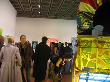
On the second floor, you entered to a florescent lighted buggy. Every floor had its "impact punches"! To me this room was all very bright and not appealing.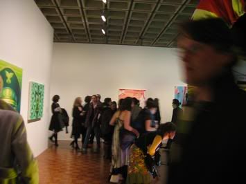
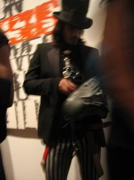
I think this guy was doing a sound/installation piece...or at least he looked like he had something to do with the room he came from? The room had a small shack that had light pouring out the cracks while crazy noise rock played. Inside the shack there was a drum set.
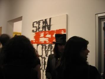
todd norsten - I featured todd a month or so back on the blog. I like his work but I found the work in the biennial to be my least favorite of his works.
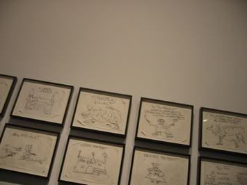
taylor mead - very funny piece. This well known 80+ year old artist is a poet and writer. The drawing illustrate a story of a castle, monster, prince and princess..and in the end...the castle goes up for rent. Very fun.
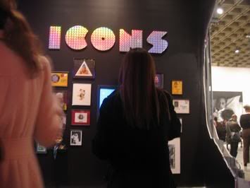
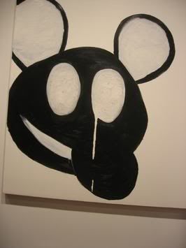
This piece had noise and video attached. It was a little mickey-mouse cartoony.
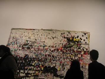
mark bradford - collaged paper on canvas. Somehow a very crafty piece was made to look like computer pixels.
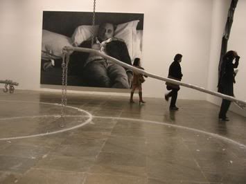
orbiting burning candles and giant hole in the wall - urs fiscer. This piece created the most impact in the space. The metal arms that circled the floor held a candle each...and created a wax drip trail on the floor. The painting, yes painting behind the candle piece was insanely huge! The skill level was there, I mean come on who is going to paint that large and photographic, but after that notion it left me dry.
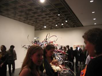
liz larner - metal tubes assemblage sculpture - LA artist
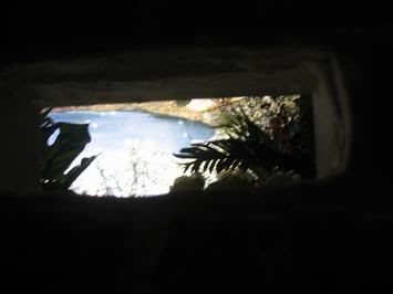
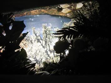
jones and associates - (above/below) there were two small brick size cuts in a wall in the corner. once you looked inside you saw a tropical paradise. It reminded me of the piece at the ccs faculty show where you looked into a hole in the wall to see an eye staring back at you. I think mini-staged environments are a current art trend.
There were so many other pieces that I wished I could have taken pictures of...but I hope to have some press pictures to post soon!

On the second floor, you entered to a florescent lighted buggy. Every floor had its "impact punches"! To me this room was all very bright and not appealing.


I think this guy was doing a sound/installation piece...or at least he looked like he had something to do with the room he came from? The room had a small shack that had light pouring out the cracks while crazy noise rock played. Inside the shack there was a drum set.


todd norsten - I featured todd a month or so back on the blog. I like his work but I found the work in the biennial to be my least favorite of his works.

taylor mead - very funny piece. This well known 80+ year old artist is a poet and writer. The drawing illustrate a story of a castle, monster, prince and princess..and in the end...the castle goes up for rent. Very fun.

This piece had noise and video attached. It was a little mickey-mouse cartoony.


mark bradford - collaged paper on canvas. Somehow a very crafty piece was made to look like computer pixels.

orbiting burning candles and giant hole in the wall - urs fiscer. This piece created the most impact in the space. The metal arms that circled the floor held a candle each...and created a wax drip trail on the floor. The painting, yes painting behind the candle piece was insanely huge! The skill level was there, I mean come on who is going to paint that large and photographic, but after that notion it left me dry.

liz larner - metal tubes assemblage sculpture - LA artist

jones and associates - (above/below) there were two small brick size cuts in a wall in the corner. once you looked inside you saw a tropical paradise. It reminded me of the piece at the ccs faculty show where you looked into a hole in the wall to see an eye staring back at you. I think mini-staged environments are a current art trend.

There were so many other pieces that I wished I could have taken pictures of...but I hope to have some press pictures to post soon!

2 Comments:
hey....how did you get the pictures if they werent allowed? Did you use a phone camera?
Im glad you got some, though....
A little wild .Some nice paintings thou.
Post a Comment
<< Home