he said she said
Tonight's opening was at Primary Space http://www.pr1maryspace.com/ in
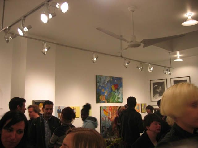
Who are these people and where did they come from? The generally younger crowd, who sported a "look", filled the small gallery space. As I tried to push my way through the swarms, the attendees weren't recognizable from the regular gallery circuit of Birmingham- Ferndale-Detroit. I felt as though I had stepped into an alter-universe of
I have a problem making my way to Primary Space because I already know what the art will look like before I go. I would sum it up as graphic design meets hipster. The show's title "he said she said" was based on an overly explored topic of the differences between men and women. The long description of the show's content felt like a slap in the face. It was like a grill cheese sandwich with a fancy, gourmet description: no matter how you put it, it is still just cheese and bread. Why is it that weak art can't be held up by pretensious art talk, but visually pleasing art can stand alone? Can it? Or are some fooled? I think that there must be some happy medium between concept and content. Trust me; I don't want to go down the decorative road either.
The problem when a gallery's work is the same in style is that when one or a few pieces of art is weak then the whole show is remembered as weak. There are no stand-outs when everything is similar. If Primary Space mixed it up, then the "gems" would stand out.

Packed!

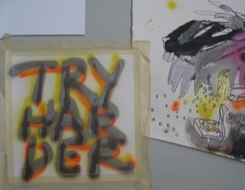
A strong pair. Sometimes the strongest piece is when an artist knows when to stop. Simple yet attunded sensibility: a quiet sophistication.

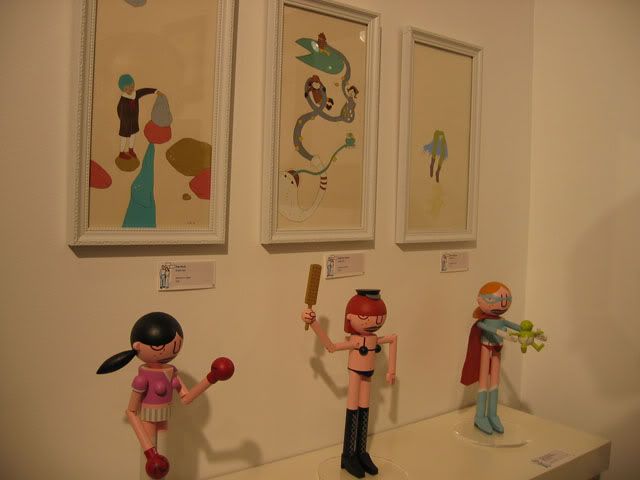
Very strange....when woman attack?!
All and all, it was great to see another crowded opening. Now let's just get working on those red dots!


0 Comments:
Post a Comment
<< Home