Outpost @ Hilberry
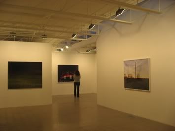
TIM DAVIS
JOHN LEHR
MICHAEL VAHRENWALD
ORGANIZED BY BRIAN D. MAHONEY (click link for better photos...yes, photos under glass are hard to capture during an opening for all you pic critics out there)
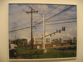
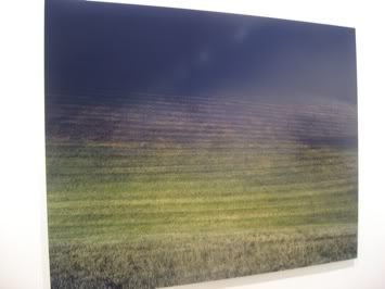
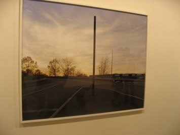
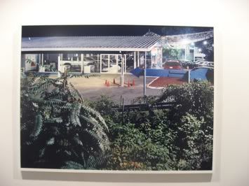
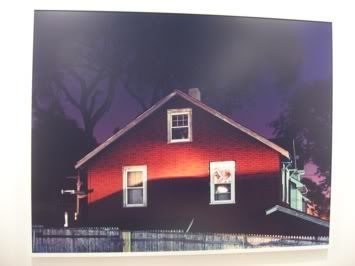
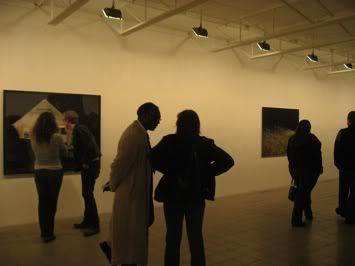
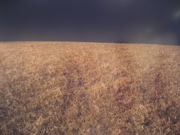
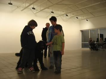
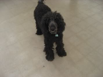
It is not normal for susanne to let Ida roam around the gallery but I thought that it somehow made for a more casual way of discussion to happen. It was like the dog broke up the serious opening mentality and was the hot potato for art conversation. I saw as people and children reacted to the dog and then in turn seemed more approachable. I know it sounds corny but could a gallery dog help create a more conversational atmosphere?
I enjoyed the photographs...I am always up for large scale c-prints but I was a little rushed so I can't give a full account of opinion. Photographs are something that I need time with because I feel they tell a story. It isn't about mark making and execution so much as the content and mood of the photograph.
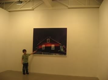
I love this pic...I didn't even ask him to pose but saw him presenting this photograph to his father like he had made the print. What a great moment!
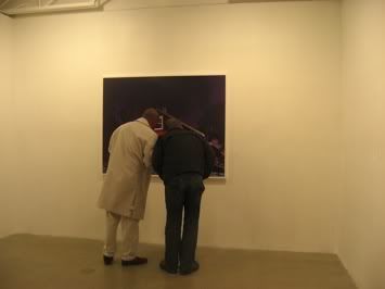
I also love these two men diligently looking at this print...isn't this what it's about?
JOHN LEHR
MICHAEL VAHRENWALD
ORGANIZED BY BRIAN D. MAHONEY (click link for better photos...yes, photos under glass are hard to capture during an opening for all you pic critics out there)


It is not normal for susanne to let Ida roam around the gallery but I thought that it somehow made for a more casual way of discussion to happen. It was like the dog broke up the serious opening mentality and was the hot potato for art conversation. I saw as people and children reacted to the dog and then in turn seemed more approachable. I know it sounds corny but could a gallery dog help create a more conversational atmosphere?
I enjoyed the photographs...I am always up for large scale c-prints but I was a little rushed so I can't give a full account of opinion. Photographs are something that I need time with because I feel they tell a story. It isn't about mark making and execution so much as the content and mood of the photograph.


I love this pic...I didn't even ask him to pose but saw him presenting this photograph to his father like he had made the print. What a great moment!

I also love these two men diligently looking at this print...isn't this what it's about?

15 Comments:
I'm sorry but this show was total shit:
Lehr’s use of a large-format view camera drives him to select his subjects strategically, and encourages subtle adjustments of angle, exposure, and other variables to reveal the mystery in what would otherwise seem boring or monotonous. ..the large outdoor signs -- by shooting them in profile he divests them of their intended meaning and casts them in a new light.
What a pile! I must say. Boring and monotonous crap. Looks like Yale grads are in the lead to bringing about the recent "death" in photography.
this is one show I can look at entirely online, thanks to the great photos on the gallerys website. Thanks Ann for pointing me in that direction, and saving me gas money! I dont particularily care for this work enough to make the trek.....its not like they are paintings or sculpute with interesting surfaces to look at
I enjoyed your supplemental pics of the openeing, with the dog, the little boy, and the people viewing the work. This was the real treat. Please keep adding shots like this to your reportage, it gives it heart
there is a gallery here in seattle that has a resident dalmation named Zippy. However, Zippy does not like hugs and last week he nipped me. So, dogs can have a downside.
dear m.
your logic is amazing.
A piece of paper once gave me a paper cut. Paper can have a downside.
Everything can have a downside. So what?
jim,
:-P Can't take an anecdote?
Dogs as a whole are a bit more unpredictable than paper. I happen to love dogs and paper equally, but I respect the reasoning behind the majority of ordinances that require dogs to be leashed and/or barred from public spaces.
She had been taking a lengthy list of medications, including methadone for pain and valium, but those drugs were at therapeutic levels, he said. A bacterial infection from injecting medication in her buttocks and the flu contributed to her death, according to the report.
She had been taking a lengthy list of medications, including methadone for pain and valium, but those drugs were at therapeutic levels, he said. A bacterial infection from injecting medication in her buttocks and the flu contributed to her death, according to the report.
dog more interesting than the art:
hilberry lost her space in birmingham because her dog (although not this one) -- attacked a visitor.
I honestly can't get enough of this work about land use. I think these pieces accurately depict the everyday suburban/exurban paradigm. Its like contemporary genre painting (only through landscape photography).
Say what you will about this work being boring and monotonous, but so is big box retail. Thats the point of all this. Its a frank depiction of the landscape we engage with.
every unaltered photograph is a frank depiction of our landscape. big deal. we live in it.
someone gets a camera, a theory (usually benjamin), and blows it all up -- and ooh and aah.
lame and dull images may reflect our life, but don't make interesting art.
I would be hesitant to say that every unaltered photograph is a frank depiction of our landscape.
Perhaps these guys should consider photographing our nation's beautiful covered bridges. It would certainly be pretty, but would it be as emblematic of our development patterns over the past 30 years?
I think its quite interesting to take inventory of how much disgust there is surrounding this work, and then thinking of all of our roles (some more direct than others) in shaping this landscape.
they're friggin' houses and hills, oooh scary! frank depictions of our neighborhoods!
oh yeah, give me more abandoned detroit houses too while you're at it. that's even more real. that's fresh.
trying to read too much into too little never adds to anything worth crossing the street for.
and yes, while being frank, covered bridges are still a very important part of our current landscape -- it's what's projected as true americana and what we pine over and travel hundreds of family miles to drive through and over. and there are plenty of calendars if you want that sort of thing.
and it's all what it is, part of the american landscape, and these images don't make any of it anymore enlightening.
maybe you're right. maybe these images should be on our calendars now.
but no sturm und drang. no insight into anything we don't already live and experience and know when we step out our doors. mediocre ideas pumped up with artspeak and mediocre images pumped up by scale alone.
Tim Davis is the only one who's content really bores me. The other two are making fantastic mysterious and ultimately very formal photographs. I certainly don't read any dull political statement from either of them.
Tim's are nice images but the "consumerism" referance just kills me every time.
I keep hearing "consumersim" and "subarban sprawl/McMansion" from all the people I don't want to hear it from (grad students, proffesional artists, etc.) My God, at least widen the vocabulary. But more, everyone knows we consume, everyone knows we alter the landscape, everyone knows HOW we alter the landscape. Walking fucking alters the landscape.
These people must know these phrases are tossed around all the time. Saying "consumerism" hasn't changed anything. Say something else. Please.
That was a tangent, sorry.
I love your tangents
I don't think anyone has used the terms "suburban" or "consumerism" in this thread have they?
Post a Comment
<< Home