Part II: Shrinking Cities @ MOCAD
If Cranbrook's Shrinking Cities exhibit had been the only part of this show, it would have painted a bleak and depressing picture of Detroit, Halle/Leipzig, Manchester/Liverpool, and Ivanovo. Gladly there is a Part II that exists in Detroit at MOCAD. Putting the solution downtown makes a firm point to those traveling to the show that the answer to the problem outlined in the exhibition means driving downtown and existing and partaking in activities in Detroit! It sounds like an easy enough concept but I know that even for my parents, and those like them who where around during the time of the Detroit riots, the thought of going downtown isn't something that crosses their minds often. Many suburbanites still think the city is unsafe as a whole.
Right now is a great time to experience MOCAD because the previous exhibit is still intact and condensed in what I think even makes for a more strongly focused exhibit and the rest of the space is used for the Shrinking Cities Part II exhibit. (Make sure to read Part I.)
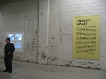
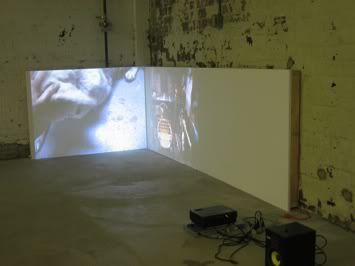
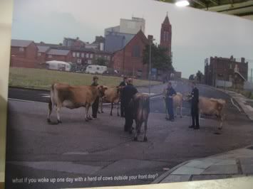
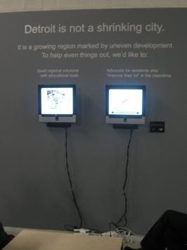

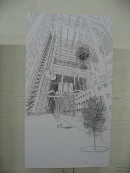
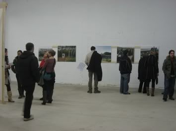
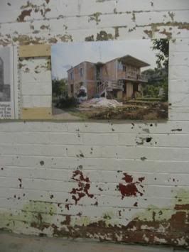
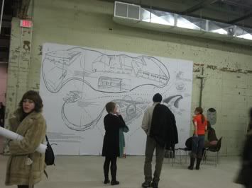
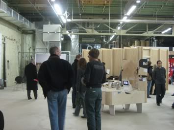
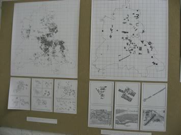
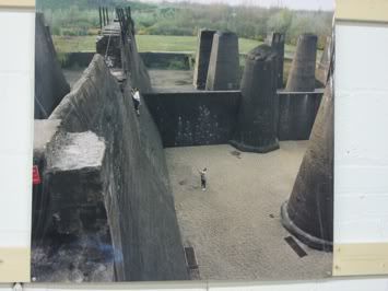
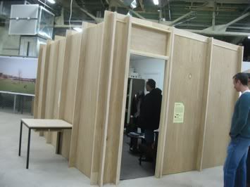
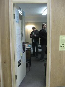
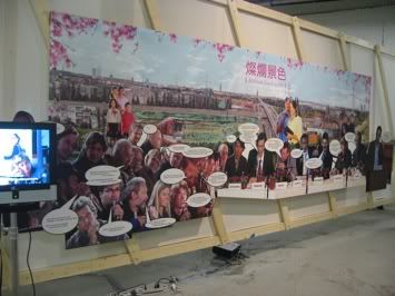
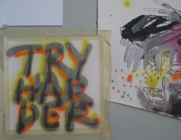
There is a vast difference in the MOCAD part when it comes to display. Everything at Cranbrook was neatly framed and hung on the pristine white walls while MOCAD chose to mount pictures on 2x4's and paper diagrams tacked to cardboard without any frames or glass. Even on one brick wall (below) a blown-up photocopy of a drawing is pasted in sections showing the unevenness of the wall with the opening seams revealing the concrete. The space is raw but should that mean that the craft in display should be different than at Cranbrook? Talking with one of the event coordinators, I learned that everything was very deliberate: from the construction to the way the labels were pasted. From what I understand, MOCAD staffers want the museum to be edgy and different and to definitely compete with the DIA. Getting over that point, the show still felt somewhat thin compared to the first part. It could have been that my eyes had already seen too much art for one night but I spoke to others who felt the same way. One art critic told me that she could barely read the description labels because of the font used.
Right now is a great time to experience MOCAD because the previous exhibit is still intact and condensed in what I think even makes for a more strongly focused exhibit and the rest of the space is used for the Shrinking Cities Part II exhibit. (Make sure to read Part I.)


There is a vast difference in the MOCAD part when it comes to display. Everything at Cranbrook was neatly framed and hung on the pristine white walls while MOCAD chose to mount pictures on 2x4's and paper diagrams tacked to cardboard without any frames or glass. Even on one brick wall (below) a blown-up photocopy of a drawing is pasted in sections showing the unevenness of the wall with the opening seams revealing the concrete. The space is raw but should that mean that the craft in display should be different than at Cranbrook? Talking with one of the event coordinators, I learned that everything was very deliberate: from the construction to the way the labels were pasted. From what I understand, MOCAD staffers want the museum to be edgy and different and to definitely compete with the DIA. Getting over that point, the show still felt somewhat thin compared to the first part. It could have been that my eyes had already seen too much art for one night but I spoke to others who felt the same way. One art critic told me that she could barely read the description labels because of the font used.


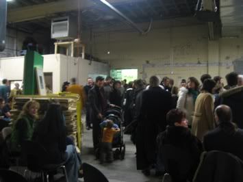
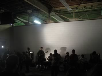
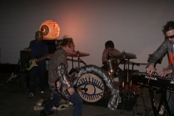
A fun part of the evening that brought everyone into the front room was when the bands went on. I felt that it was a good choice for music...but let's say I wasn't surprised when I saw who was performing - but that's another story for another time. Odu Afrobeat Orchestra was a great choice for this show in merging new beats with traditional African music.

5 Comments:
A FINE FEATHERED GENTLEMEN EXPLAINS WHY THE HUMAN EYE AND THEIR "ART" WAS THE MOST COMPELLING PART OF THIS EVENT ....HERE
It was like walking through a textbook. Only with the page numbers all shuffled.
the font used is terrible and makes reading the huge amount of data a very tedious task.
MOCAD - an insular in-crowd of backslapping careerists using half baked art as a backdrop to a cavernous space that will end up as yet another artfully shitdumpesque "D" warehouse playing the latest going-nowhere-fast bands for the endless streams of hipsters and twenty-somethings spewed out every year from art school. Gee, sort of sounds like CAID?...Detroit as a cultural destination is and always will be a burned out cultural backwater visited on weekends by the too young and too hip to matter. Shrinking Cities? Shrinking Ambitions morelike...
to the last guy your an asshole, with probably no taste in music or art for that matter. keep your negativity out of it. Detroit has some of the greatest talent in the u.s. as far as i am concerned, iv'e met more great artists here than anywhere iv'e traveled. It's on the rise.
Post a Comment
<< Home